
Music Masters branding: Making music and creativity inclusive for every child

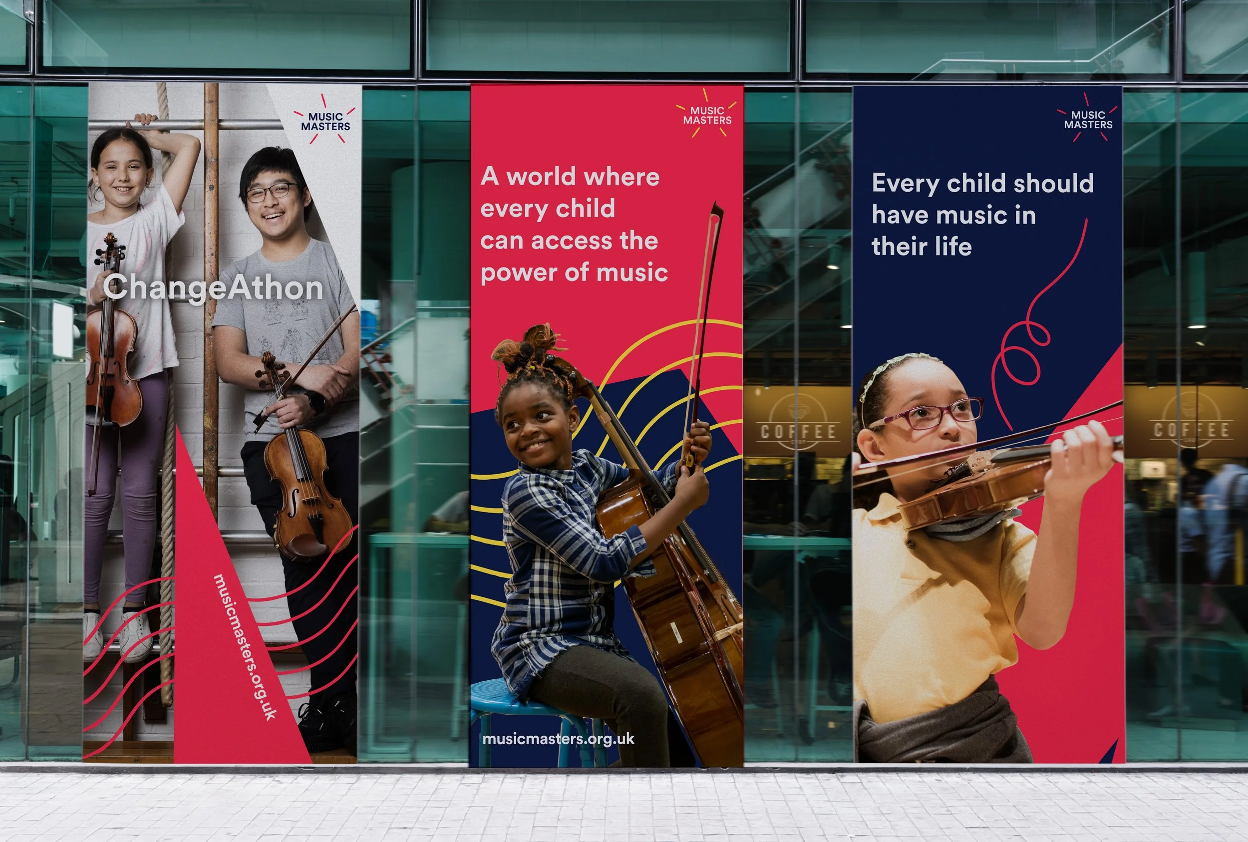
Music Master’s poster at a music venue
The Challenge
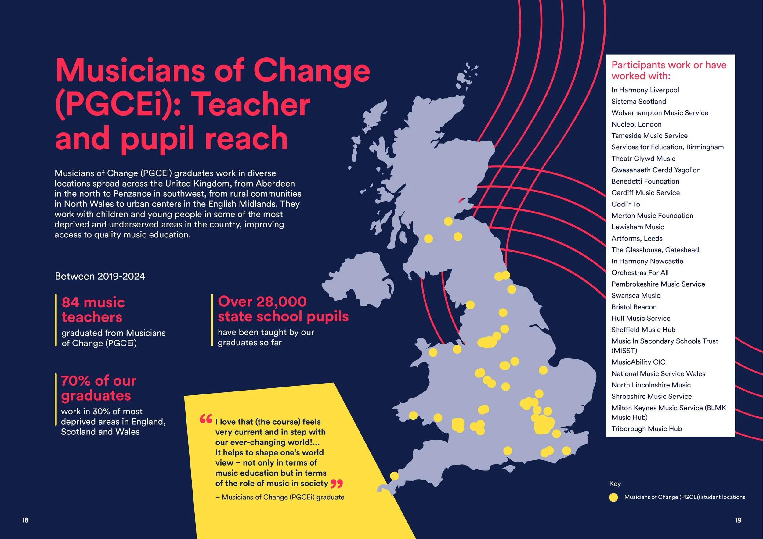
Music Masters believes every child should have the chance to reach their creative potential, no matter their background or needs. But the charity had outgrown its identity. What began as a London-based organisation had grown into a national movement for change — training music teachers and opening doors for children who might never otherwise have touched an instrument.
Yet, the brand felt stuck, conservative, and lacking the energy of music, creativity, and play — the core values the organisation stood for. They needed an identity that could match their new scale: fresh, dynamic, and unapologetically creative, while still maintaining the trust and recognition they had already built.
The solution
The job wasn’t to start over, but to evolve — keeping the elements with equity and amplifying them in new ways.
At the heart of the brand, we found its most powerful symbol — the five simple lines of the stave. From those lines, infinite possibilities emerge. We built a visual system on that foundation: five lines, whether straight lines, rippling sound waves, or looping expressions of energy. Sometimes playful, sometimes bold, always playful.
We grounded the identity in navy — a nod to Music Masters’ classical roots — while rebalancing the palette with a more dynamic red, lifted with yellow for brightness and youthfulness. With a broader set of colours, this added energy and variety across digital platforms, including the website and social media. The “M” became a versatile device: framing photography, acting as a background shape, or drawing focus in layouts. Together, these elements provide the brand with both consistency and flexibility. The brand now feels like Music Masters – dynamic, youthful, and rooted in the joy of music. It reflects the organisation’s scale and ambition while remaining recognisable and trusted. A brand staff, students and teachers can be proud to carry forward.
-
Brand audit and stakeholder interviews
Creative development
Logo design
Visual design system
Brand guidelines
Microsoft brand templates
Brand training
Website wireframes and design assets
Rollout of brand materials


Music Masters branded pull up banners

“The work Kath has done with Music Masters has not only energised our brand identity but she has also become part of the family. We have great looking products and presence and we know we can rely on her to support our projects and initiatives, even when time is tight.”